When a company grows rapidly, the design solution that worked in the beginning might become outdated and not scalable. My goal in this project was to conduct user research and create a new navigation structure and landing pages that would work for multiple personas and could scale with the company.
Navigation and Landing Page Redesign
Help surface insights for each persona
Project Stages
- Secondary Research
Heuristic evaluation of the website
Analytics review
Content audit
Help site review
Current site map
- Qualitative Research
Research Plan
User Interviews (2 types of users, 9 interviews)
Interviewing the team (6 in-depth interviews)
- Research Findings & Next Steps
Customer personas
Customer journeys
User flow
Design goals
- Design
Navigations concepts
Landing page design
Updated site map
Prototype development
- Test
Usability testing plan
Usability testing
Insights & report
- Iterate & Finalize
Finalize design
Design review
Document requirements
Final deliverables hand-off
Role: UX Researcher, UX Designer
Duration: 3 months
Background
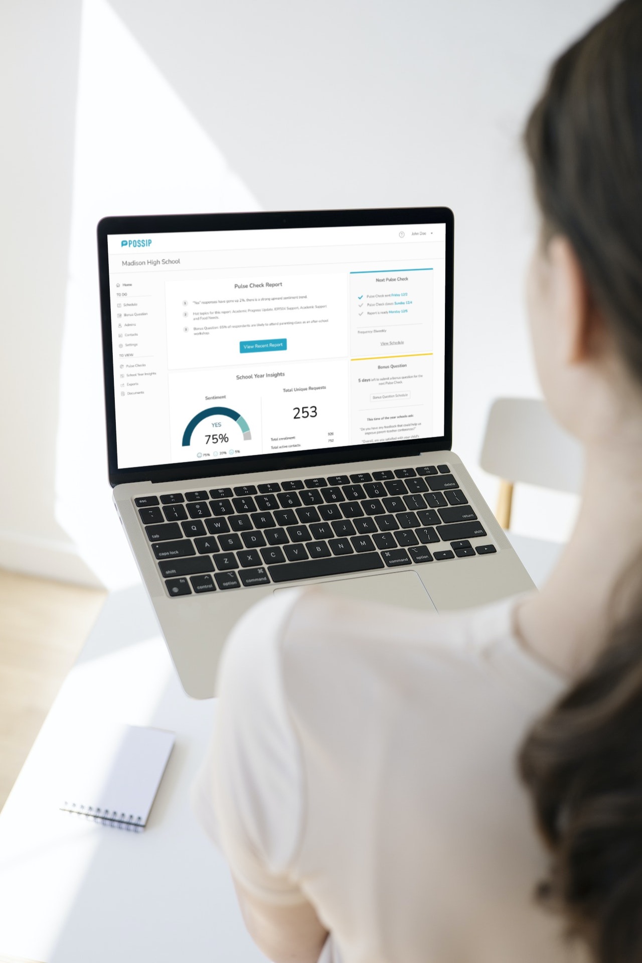
Possip helps connect schools with parents by sending recurring SMS and email surveys and providing insights for school leaders through robust analytics.
Possip prompts parents for weekly feedback, and turns that parent engagement into data the schools use to track trends, solve problems, and bring joy to teachers and parents.
“Parents had one set of information. Schools had another set of information. And they weren’t talking to each other. I decided to change that”.
- Shani Dowell, Possip’s Founder and CEO
Problem
As the company rapidly grew from serving 7 school partners to over 1,000 organizations over a span of just a few years, their web platform needed to be revised and updated. It expanded from serving one type of customer (school leader) to working with districts and organizations often managing multiple accounts.
Our goal was to conduct thorough research of the current solution, identify the customers’ needs and pain points. And create a scalable prototype to meet the needs of multiple personas.
- Secondary Research
Heuristic evaluation
Session recordings
Analytics
Support requests overview
Heuristic Evaluation
As a result of the heuristic evaluation we have discovered a few user experience patterns that could be improved.
Inconsistency in page names and user routes (#4: Consistency and standards)
Error prevention messages aren’t available in most scenarios (#5: Error prevention)
Action reversal is not always possible (#3: User control and freedom)
Navigation items names and order is not consistent (#1: Visibility of system status)
Support Requests Overview, Session Recordings & Analytics
In addition to heuristic evaluation, we have looked at the customer support requests to identify main pain points and questions customers need help with. We have reviewed analytics to see which pages users visit the most, and which are of less importance. We have also watched recordings of user sessions on the website and reviewed heat maps to create current user behavior patterns, the routes they take and the obstacles they experience. This has given us a good insight into user behavior on the website.
- Qualitative Research
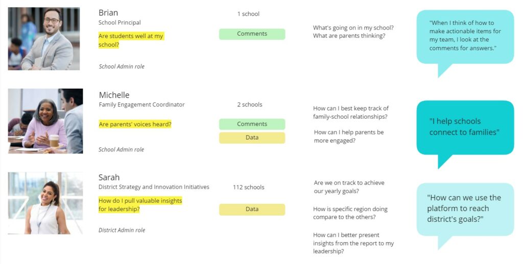
In order to create the right solution, we needed to talk to the customers. And to have a full picture of the whole process of the client-team interaction we have interviewed the team members who work with the website and customer requests as well. We have identified two types of customers that need to be interviewed, based on their access to the platform: school leaders and district leaders.
We have interviewed 9 customers, and 6 team members. It helped us create user personas and user journeys, identify pain points and needs of both customers and the team.
- Research Findings
Building Relationships vs. Seeing a Big Picture
We have uncovered the needs of the two categories of users:
School leaders are focused on building relationships with their audience. They mostly read parents’ comments and want to make sure they are on top of things. Having a parents’ voice heard and building strong relationships is the main goal of their interaction with the platform. They are interested in analytics, but don’t have the capacity and the need to dive deep into the analytics and trends.
“I like to read all the comments myself”.
District leaders are mostly interested in seeing a big picture and delivering data insights to their managers. They generally manage multiple accounts, and don’t have the capacity or the need to read all the comments from all the parents. But they track overall trends for each school and the district. Surfacing global insights for them would bring the most value.
“Take all this information and summarize to 2-3 takeaways for our leadership”.
We have also identified a user category that incorporates both needs and serves as a link between a school leader/school leaders and the parents.
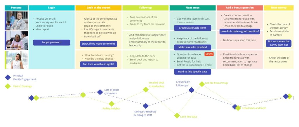
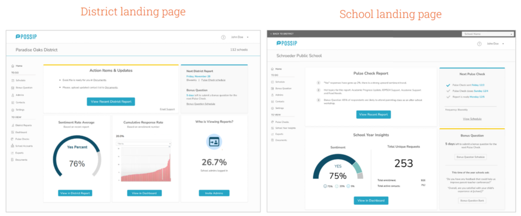
Based on these results we have created three personas and a detailed user journey for each persona, as well as a simplified user journey that helped see the difference in user experience from the first glance when presenting to the client. This allowed us to see the pain points and the needs of the users more clearly. We could see the points of most stress and most gain. User personas and user journeys have led to creating a unified solution, scalable, as the company grows and serves a variety of customers.
- Design
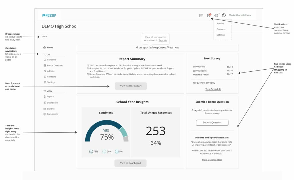
Consistency across all pages
Easy way back
Distinguish between types of users
Page names always visible
Important information at user’s fingertips
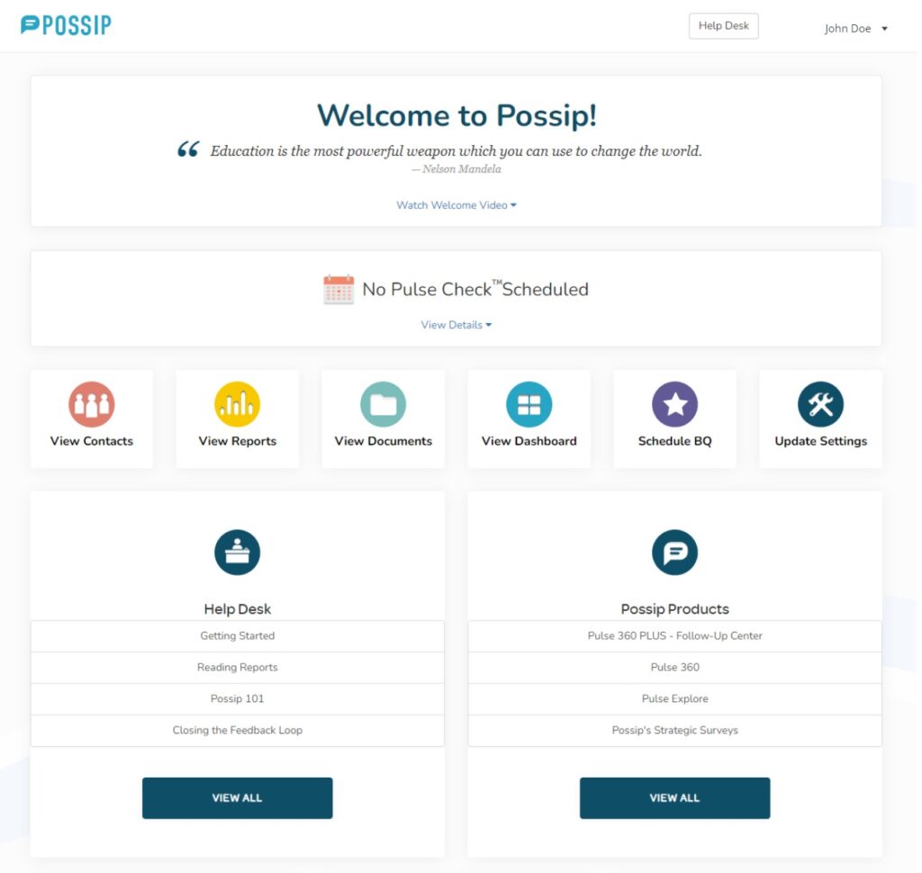
Compare to the previous design solution:
- Usability Testing
What we tested
Are users able to navigate seamlessly from page to page?
Can they find their way back to the landing page?
Tasks:
View recent report
Navigate to year to date insights
Add a Bonus Question
Add admin
Update contacts
Look up the schedule
Update settings
Change password
10 participants: 6 established platform users familiar with the environment, and 4 non-users.
Reason for recruiting users and non-users: to check how well a person not familiar with the platform can navigate to the pages and understand where to go to get insights.
Results
Overall positive feedback:
“I like how clean the page looks.”
“I like the survey dates on the right, because we sometimes forget and need to look them up.”
80% – looked for “change password” in Settings -> Add “change password” to Settings.
60% – navigated to Dashboard from the first try -> rename Dashboard into School Year Insights.
- Iterate & Finalize
We’ve updated the design solution based on the usability testing results, rearranging information, deleting items that weren’t utilized by the users, differentiating analytics from maintenance items on the landing page.
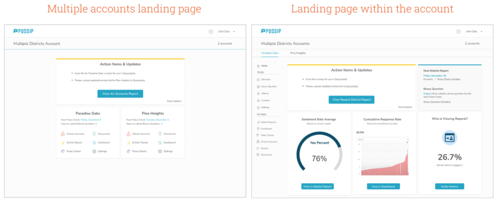
We have also created solutions for different personas, depending on which accounts they manage.
Usability Improvements
1) Consistency. Menu order, page and item names.
2) Visibility of page name. Page name is always visible, in the same place. Menu item is always highlighted.
3) Clear and visible way back. Breadcrumbs and other hints to lead the user back up the navigation tree.
4) Switching between District and School. Clearly define when a user is under a district menu and when he is switched to school menu.
5) Initial guidance through the platform. Hints that help a user learn the platform after receiving their first Pulse Check report.
6) Separate user flow for new users/new school year. Step-by-step guidance to encourage users to fill out details in Settings and submit information to Possip to start Pulse Checks.
Chat with me
If you are interested in learning more about my experience, or if you have a collaboration in mind, drop me a line!
camomint@gmail.com
(614) 495-6244